Leverage The Halo Effect: Create A Digital Experience (Lessons From Apple)
Do you keep the boxes from your Apple purchases?
I actually still have the box from an old MacBook Pro lying under my bed. If you’re anything like the other millions of Apple fans you probably do too.
Have you ever wondered why we do this?
It’s definitely not random.
Apple’s packaging is an intentional part of their marketing strategy. In fact it taps into a powerful psychological principle called ‘The Halo Effect’.
Why We Hold Onto Apple Boxes
Apple has a deep understanding of human psychology. They understand that the way a product is presented influences the way we feel about it. Here’s a key principle from Apple’s marketing playbook:
“People DO judge a book by its cover. We may have the best product, the highest quality, the most useful software etc; if we present them in a slipshop manner, they will be perceived as slipshod; if we present them in a creative, professional manner, we will impute the desired results.”
This highlights Apple’s commitment to impute—or the idea that beautiful packaging creates the perception of a high quality product. This taps into the halo effect—where our first impression of something (like great packaging) influences how we feel about everything else related to it.
Aka we DO judge a book by its cover.
Jony Ivy, Apple’s former leading designer:
"Steve and I spend a lot of time on the packaging. I love the process of unpacking something. You design a ritual of unpacking to make the product feel special. Packaging can be theater, it can create a story."
Steve Jobs was obsessed with creating not just products, but experiences. He wanted every interaction with an Apple product to feel special — from the moment you pick up the box. He believed that the packaging should build a sense of excitement and anticipation, making the product feel like more than just a piece of tech.
Ever noticed the slow “whoosh” sound when you lift the lid off an iPhone box? It’s not by accident. The resistance of the box is engineered on purpose to create a sense of luxury, anticipation, and delight.
It just feels premium.
Apple takes this unboxing ritual so seriously—they even have a dedicated “packaging room” where designers spend months perfecting the unboxing experience to evoke the right emotions.
Apple from a patent application for the iPod:
“It may diminish from the aura of such a well-designed product to present it to consumers in a standard cardboard box. A package that is more fitting of the high-tech design of the product is what consumers have come to expect.”
The Halo Effect & Your Brand
So what does all of this have to do with your brand?
And how can you leverage the halo effect in your marketing?
It’s simple.
By investing in high-quality design.
Because this cognitive bias also relates to web design (and your online brand aesthetic overall).
“If users like one aspect of a website, they're more likely to judge it favorably in the future. Conversely, if users have a particularly bad experience with a site, they'll predict that the site will treat them poorly in the future as well and, thus, will be reluctant to return to the site.”
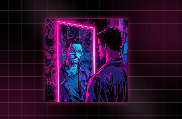
I think about web design (or your digital presentation) the same way Apple thinks about their packaging.
You are creating a digital experience.
Your website, brand identity, and digital presentation are the packaging for your content. These elements influence how your audience perceives the value of your offering.
Imagine you’re walking down a street lined up with beautiful shops. You get to the end and see a busted up shop covered in cobwebs, broken windows, and litter out front.
Excited to walk in?
Probably not.
Your digital storefront is no different. If your website looks unprofessional, outdated, clunky, or has inconsistent branding, visitors will subconsciously assume that your products or services are lacking, even if they’re top-notch.
This is ‘The Halo Effect’ in action (or not in action?).
In fact the opposite is called ‘The Horn Effect.’ If something is poorly presented—we may perceive it as low quality, even if that’s not the case.
Designing Your Digital Experience
I want to reiterate.
You are creating a digital experience.
What feelings do you want to convey?
What emotions do you want to evoke?
For example, one of my brand values is FUN — so high energy and excitement are some of the emotions I want to tap into when I think about the overall vibe people get from my brand.
To convey these emotions — I draw inspiration from video games and choose bold, vibrant, and edgy design elements.
Now, obviously your website still has to be functional. I’ve seen some very cool and creative websites, but they were confusing to navigate (and sometimes slow to load) so I left.
You still need to have intuitive navigation (or usability). Then add in your creative design.
Intuitive Navigation (Usability):
- Clear layout and structure
- Easy-to-find information
- User-friendly interface
- Consistent design patterns
Creativity (Aesthetics):
- Unique, eye-catching design
- Memorable visual elements
- Innovative interactions & page animations
- Strong brand identity

The sweet spot is in the middle, where intuitive navigation (usability) meets creative design (aesthetics). This ensures the website is not only visually compelling but easy to use.
Let’s call this intersection ‘Functional Art’ because it is not only aesthetically pleasing but it serves a practical purpose.
The same way Apple's beautifully designed boxes still function as... well... boxes.
I hope you found this newsletter insightful.
Ready to leverage The Halo Effect and package your ideas in a way that’s both aesthetically pleasing and functional? Check out High Impact Web Design to create a siiick digital experience that attracts, engages, and converts. 🔥
I’m ready when you are — press play to start.
—Priscilla [Player 2] 🕹️


.png)

.png)


.png)


.png)

.png)

